14 February 2024
How the ePaper Universe design strengthens the user experience
The user interface design is key to your ePaper success. Here are our thoughts on the design and how it facilitates the smoothest and most user-friendly experience.
14 February 2024
The user interface design is key to your ePaper success. Here are our thoughts on the design and how it facilitates the smoothest and most user-friendly experience.
Would you rather listen to the article? Press play and have the article read aloud by the Text-to-Speech Google Cloud speech synthesis.
Being on top of the digital newspaper innovation game is key at Vitec Visiolink. We are continuously in dialogue with our customers to uncover their ever-changing needs. We do our best to translate these into new, tangible, and user-friendly features. You see, it is not enough to be able to predict the next big thing within digital news publishing.
Wrapping new features in a way that facilitates the smoothest and most user-friendly experience possible is key to the success of any digital newspaper app. Here are our thoughts on the design.
You cannot put a single definition to what constitutes a good user experience; it is context dependent. But the characteristic of any good user experience is that it meets the user’s needs in the moment of usage.
When designing user interfaces of ePaper apps, it therefore makes sense to take a step back and try to find answers to the questions: Why do users consume news apps? What are the primary drivers behind their interaction with an ePaper app?
Altogether, the matter of fact is that ePaper users primarily consume news apps to get updated on the latest stories. Apart from that, they expect it to be served in the most convenient, seamless, and intuitive way possible. This is not least true for young consumers under 35 years old (source: Reuters Institute).
This segment uses news apps to efficiently access news in between other activities. They expect news apps to structure content according to a timeline or use a seamless and intuitive navigation design. Meanwhile, news apps that mimic physical newspapers are considered too difficult to navigate.
The design in the ePaper Universe was developed to meet these expectations and complement intuitive user behaviour. To exemplify this, have a look at the illustrations below. The one on the left depicts what the original Android design used to look like. The one on the right depicts what it looks like with the ePaper Universe design.
One of the most distinctive characteristics of the ePaper Universe design is that it structures content in, yes, full-width modules. Compared to the former Android design, users are now presented with a clear overview of where to find specific types of content - e.g. editor’s pick, videos, live news, podcasts, etc.
This design was developed according to some of the most fundamental laws of human perception theory – the Gestalt Principles. Following the Interaction Design Foundation's definition, the Gestalt Principles describe how we, as humans, unconsciously group similar elements, recognize patterns, and simplify complex images when we perceive objects.
Our ePaper Universe design especially rests on the principles of common region and proximity. These explain how we intuitively decode content elements grouped as sharing essential characteristics, which sets them apart from more distant groups of content. Our original Android design did not allow users to make these unconscious interpretations, as not all content types were grouped. Instead, users would come across a given type of content e.g., narrated articles, multiple times while scrolling down the start page.
The ePaper Universe design not only allows users to efficiently uncover where to look for specific types of content. It also gives users indirect pointers as to whether more content is available and how to locate it.
To exemplify this, have a look at the illustration below.
Notice how each module is encircled by a consistent amount of padding? Having these margins not only enforces a sleek design, it also gives users an intuitive hint that more content is available whenever the padding is absent in between content pieces of a content module.
Following the principle of closure, the human mind prefers complete shapes. In turn, whenever we are presented with incomplete shapes, we construct a whole from what is available to us. The ePaper Universe design indirectly teaches users that an element of padding is consistently applied in between pieces of content. Following the principle of closure, the user therefore intuitively concludes that more content is available, whenever a piece of content isn’t fully visible and encircled by a space margin. Add to this, how live news, podcasts, supplements, and video modules arrange content pieces according to a chronological timeline, and you have an interface, which to a higher degree makes it possible for the user to quickly decode whether they have read, listened to, or viewed the latest stories available.
Arranging content pieces in modules further allows you to display more ePaper features, such as e.g., a news archive visibly on your start page, which previously was not possible.
Have a look at the illustration of the former Android design below.
You may notice that our former Android design is likewise characterized by a consistent amount of padding between content pieces. In turn, content pieces at the bottom of the user interface equally enforce the principle of closure. However, where the former Android design falls short, is in how it does not arrange content in structured modules, which means that the user is not offered a quick overview of available content types. They may be inclined to experience some level of frustration, as the start page seems to offer unlimited content in a vertical scrolling trail.
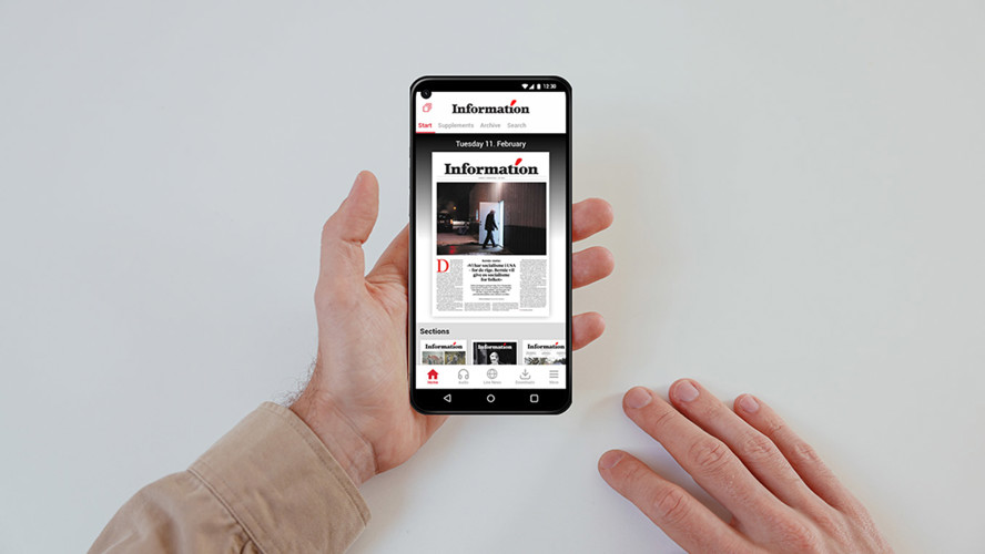
The ePaper Universe design also introduces bottom menus to the Android interface, which is intended to make the hierarchical navigation between app sections much easier for the user.
To exemplify, have a look at the illustrations above. We have primarily introduced the bottom menu to give the user faster access to content, which was previously only accessible via the menu icon. With a bottom menu, publishers can give extra attention to their most important content.
The bottom menu is also a good idea due to plain human anatomy: It is simply easier to reach the bottom of the screen with your thumb when navigating an ePaper app on tablets or mobile devices than it is to reach the top of the screen.
Furthermore, introducing bottom menus trickers instant recognition amongst a big group of users, as social networking apps have been operating with these for quite some time already. Finally, as we all know, a picture is worth a thousand words. As humans, we decode an image much faster than text, which is why we have chosen to introduce icons as a larger part of the menu navigation design.
Want to learn even more about the possibilities of the ePaper Universe design and what it looks like? Feel free to reach out to our Business Developers.


